Meaning from Words and Meaning from Visual Design
Andrew Wright
Andrew Wright author and illustrator, including Creating Stories with Children, OUP, Games for Language Learning, CUP and 1000 Pictures for Teachers to Copy, Longman Pearson. He was, for fifteen years, 'Principle Lecturer in Art and Design', at Manchester Polytechnic. E-mail: andrew@ili.hu
Menu
Orchestration of information
Lessons on the 'grammar of visual graphic design
Cover design
Page design
Design tips
Orchestration of information
We normally live in a cacophony of information received through our five senses; within this cacophony there is often a specific orchestration of information. Somebody chats to us and a poster offers information or persuasion as we are rattled and swayed on the metro. The talking and the poster are separate orchestrations of information. When looking at the poster we do not only receive information from the words but from the visual way in which they are presented. This can be compared to so many other orchestrations of information. For example:
- body expression through clothes and body movement together with vocal expression together with spoken words,
- industrial company information: product and its immediate function with the stylistic features of the shape, colour, packaging, commercials, buildings, and etc.
The role of verbal language (written and spoken) as an integrated part of an orchestration of communicative languages is rarely taken into account in language teaching. It is rather like studying the words in opera but not the music. One of the many ways of helping students to develop an awareness of the role of words related to other communicative languages is to help them to use some of these other languages in harmony with the words they are producing.
Lessons on the 'grammar of visual graphic design
The accompanying handout which I have produced for children is designed to give them a simple overview of some of the key features of the 'grammar' of visual graphic design. I have used these ideas with children during their writing, illustrating and design of their stories as they prepare them for publication in a class book of stories. Because the children knew, from the beginning of the project that their story would be published and copies given to the school library, institutions outside the school (recently we gave a collection of stories about Oetzi the Iceman to the Oetzi museum in Italy) as well as to the families of the children
they wanted to do their very, very best. I think I can reasonably assert that the children were thirsty for this information and also I think I can fairly assert that it is not prescriptive or restrictive but generative in its nature. The brief commentary beneath the designs is too brief
it needs adding to either when introducing the page to the class or when discussing design ideas with individual students. Here is a summary of some of the things which I have said to children (usually demonstrating the ideas by showing books and magazines):
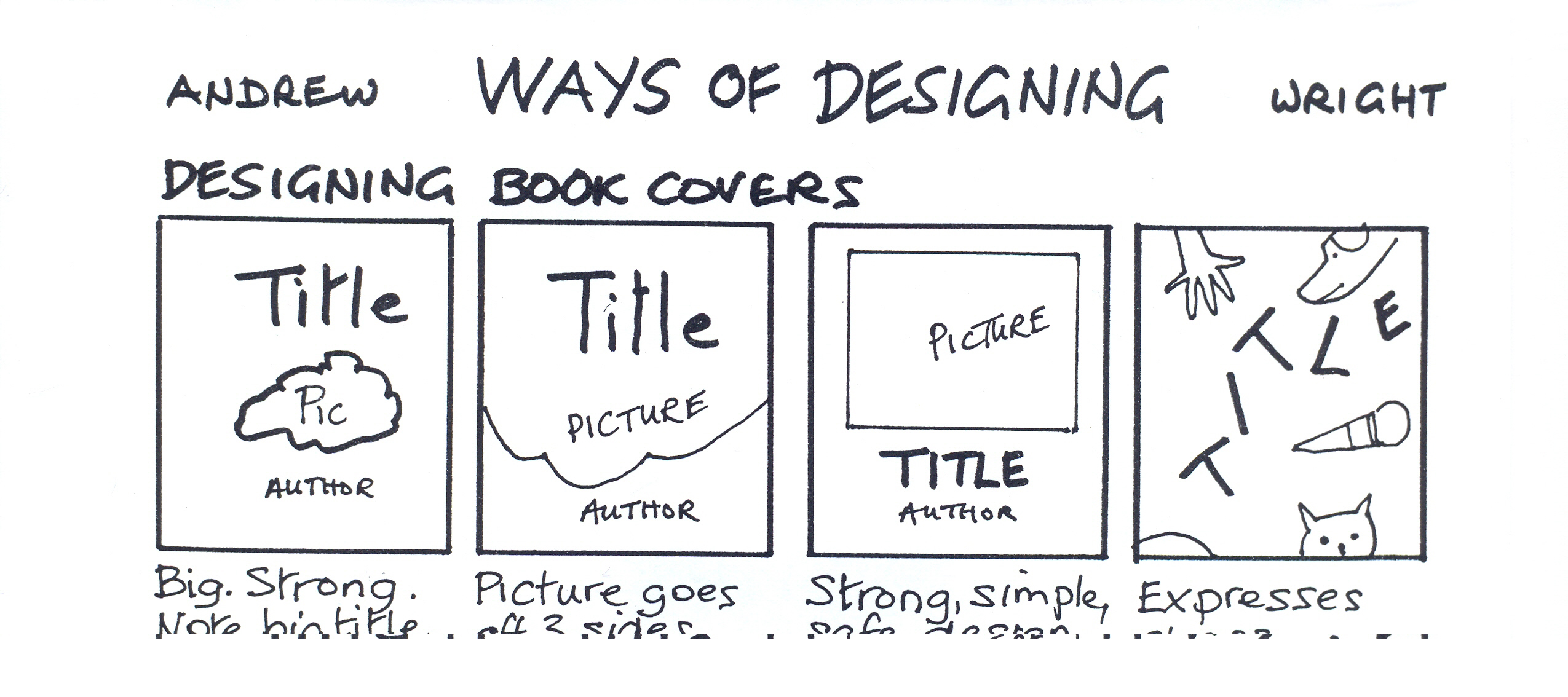
Cover design
1. The title is usually big and strong. The author's name is not handwritten on the bottom
edge of the book but proudly placed, usually centrally but not always.
2. There can be a picture within a rectangle or, if it is an object which is 'characterful' in
its outer shape, it can be free of any frame.
3. Horizontal and vertical designs are simple and safe
pictures and words floating about
express chaos
dream like or violent dependent partly on whether the shapes are
rounded or angular.
Page design
In most printed pages there is a 'grid' and all text and pictures are placed in this grid. They can be placed outside the grid but this expresses something, for example, it might express joy or violence
not conforming to the normal. Two column grids may not be so useful for stories but more for non-fiction
a single narrow cantered column suggests something rather precious and special
perhaps a poem. Text can be written on top of a picture providing it can be read and this gives a harmonious feeling to the page but also it might convey a huge size, for example, a landscape. Of course, I can't describe in words the full potential contribution of non-verbal information
if I could then the non-verbal information would not be complementary but redundant.
Design tips
Illustrations and graphic design are not just used to present surface content to be found in the words but to express a multitude of associations of feelings and ideas which may or may not be found in the text. Contrasts are rich and are common feature in visual design:
" big contrasted with small
" thick contrasted with thin
" rugged and strong contrasted with delicate and tentative
" round contrasted with sharp
" dark on light or light on dark.
All these ideas apply equally to design with paper and pen as they do to computer aided design.
Graphic design is a three year undergraduate course at degree level in the UK! However, this tiny article offers more than just a glimpse of the potential riches of card, paper, colour, tone, line, shape, texture, size, composition which make a book into an orchestration of languages not a mere solo instrument of written words.
Andrew has kindly agreed and you are welcome to photocopy the handout for your students.

Please check the The Creative Teacher course at Pilgrims website.
Please check the Methodology and Language for Primary Teachers course at Pilgrims website.


|