Back to Basics, Using Magazine Pictures with Omani Agriculture, Commerce and Media Studies Students
Neil McBeath, Oman
Neil McBeath served as a uniformed education officer in the Royal Air Force of Oman from 1981 to 2005. During that time, he took two Masters degrees and was awarded the Omani Distinguished Service Medal. Refusing to renew contract, he taught at the Technical Service Institute in Saudi Arabia for two years. He has now returned to Oman and is teaching at the Sultan Qaboos University. E-mail: neilmcbeath@yahoo.com
Menu
Preamble
Introduction
And so to pictures
Use of pictures – general
Use of Pictures – specific
Deconstructing pictures
Conclusions
References
This paper will describe a teaching strategy that is currently in use at the Language Centre of the Sultan Qaboos University (SQU) in Oman. SQU first opened its doors to students in 1986, but at the start of the Autumn Semester 2012, some newly arrived faculty expressed their dismay that the teaching facilities were so very old fashioned – i.e. there are no interactive whiteboards.
This complaint could have been dismissed as an instance of advanced technophilia, but Kamont’s (2013) recent endorsement of the virtual language environment (VLE) offered by Edmodo ends with the statement that “I cannot imagine my classes run without this aid.” (P. 45). Martin-Monje (2012), moreover, suggests that a personal learning environment (PLE) may have even more potential, particularly in the areas of English for Specific Purposes (ESP) and English for Specific Academic Purposes (ESAP).
This, I would suggest, is a dangerous trend, as it puts what are essentially teaching aids (my emphasis) at the heart of the learning process. The theory behind this approach, moreover, rests on the unresearched assumption that our current students are all “digital natives” (Prensky 2001). Benedetti, Coscia and Arriaga (2013) cite Skiba and Barton’s (2006) claim that the generation born after 1980 are characterized by their digital skills. It is, apparently believed that because “Generation Y” (Reilly 2012) have grown up with technology, they are therefore completely comfortable with its use. Far from finding the use of ICT intimidating, these students are thought to both expect and welcome its use.
Price (2013), however, has questioned these assumptions. Her evidence suggests that while many of our students are adept at using social networking sites, they are far less skillful when they are required to conduct on-line research, or access material from on-line archives. This contradiction, moreover, is supported by Benedetti, Coscia and Arraiga, who remark of their students that “despite the fact that they iuse a computer on a daily bases, are not always used to doing it as part of their academic life and as a complement to their classroom-based activities.’ (P. 10).
This paper, therefore, is an endorsement of what might appear to be a hopelessly outmoded approach to language teaching – the use of magazine pictures as visual aids. It is based on reflective teaching experience with students from the Credit Programme of the SQU College of Agriculture and Marine Science (CAMS). It examines the background theory underpinning the use of pictures, and demonstrates how carefully selected illustrations are currently being used on the CAMS programme. It also demonstrates how some pictures can be deconstructed, and how, in particular, Omani advertising illustrations could be critiqued on a Commerce or Media Studies course.
My own introduction to the use of pictures came when I began retraining as an EFL teacher at Southampton Technical College in the mid 1970s. Bizarrely, the General Studies Department at that college boasted both a Head of English (“O” Level; “A” Level; Civil Service Courses) and a Head of EFL (JMB Test of English (Overseas); Cambridge First Certificate; Cambridge Proficiency; RSA Certificate in the Teaching of English as a Foreign Language to Adults.) Both had been appointed before I joined the staff, and both held Senior Lecturer Grade, but there the similarity ended.
The Head of English was an Oxford graduate, with a particular enthusiasm for Chaucer. He was dedicated to his students, and was prepared to experiment with techniques.
The Head of EFL, by contrast, was completely unqualified. Such was the lack of accountability in British Further Education in the 1970s that she had been able to advance from being a part-time teacher of German into a full-time Senior Lecturer. She was also wedded to what Richards (1998; 46) has described as the “non-compatible view, which is based on the belief that a particular teaching conception is valid, and others are unacceptable and should be discouraged.” Good teaching, to this woman, was how she taught.
Accordingly, when the Head of English attempted to be helpful and offered her some Giles’ cartoons, they were rejected with contemptuous distain.
I found that very odd, because in the 1970s Cambridge Proficiency students were obliged to take a course in British Life and Institutions, and Carl Giles definitely qualified as a British Institution in his own right. For 30 years he had been the chief cartoonist for the Daily Express newspaper, which at that time was still a broadsheet. More importantly, the Daily Express published a Giles’ Annual – a collection of cartoons that appeared every December, and which, even then, had the status of a collectors’ item.
Indeed, Giles was held in such regard that on his death, his home town of Ipswich commissioned a memorial statue – not of him, but of his most memorable creation. This was Grandma Giles, a formidable old lady, clad in floor-length black, usually seen clutching a duck-headed umbrella and a huge, padlocked handbag.
A second point was that, in the 1970s, illustrations in ELT textbooks were of very indifferent quality. I have referred to some of these courses in other papers (McBeath 2009; 2010) but Stannard Allen (1973) offered nearly 340 pages without a single illustration; Candlin (1972;1973) used illustrations that were little more than crude caricatures, and Alexander (1967) presented small, dull, monochrome photographs.
There were also two books by J.B. Heaton (Heaton 1966; 1975) but these had their own idiosyncrasies. They were very much of the genre satirized by Raban (1979) in his description of the oilcloth pictures then used in Yemen. “It was (if a date could be put on it at all) 1951 in some idyllic Thameside suburb. Mr. Brown was listening to a fretwork-fronted radio. Its loudspeaker was concealed behind an art-deco rising sun, and Mr. Brown was no doubt listening to Alvar Liddell reading the news on the Home Service. The Brown’s cocker spaniel was curled up asleep at his feet, his pipe was drawing nicely, and Mrs. Brown, in her home-made gingham frock, was bringing him a cup of tea on a tray.” (Raban 1979; 239-40).
Heaton’s book depicted an equally placid, lost, white, middle-class society from the late 1940s or early 1950s. Little boys all wore short trousers and aertex shirts. Little girls wore cotton frocks above the knee, knitted cardigans and had bows of ribbon in their hair. Women wore hats outdoors, and indoors they had tightly permed hair, knee-length skirts and aprons. Adult men always wore hats and ties.
This was a world with almost traffic-free roads. It was a place where young children were safe to cycle off on picnics, which were held in an unpolluted countryside devoid of inhabitants. Teenage boys could ride their bicycles to the coast, leave their clothes in a neat pile on the beach and go swimming in the certain knowledge that their belongings would not be disturbed. In short, Heaton offered an attractive, sanitized version of Britain that bore no resemblance whatsoever to the 1970s society students had to encounter outside the classroom. Even on first publication, these books had limited use. Nobody would use such materials today.
Almost inevitably, this type of material caused a backlash. Holliday (2005) refers to the 1977 British Council training film called Using Magazine Pictures in the Language Classroom. Holliday appears to have reservations about this approach, saying that it “marked a major development in the perception of what teachers should be spending their time on – cutting and pasting pictures onto pieces of card to use as visual stimuli in the classroom. Although extremely practical and effective in certain teaching contexts, this image served to emphasise the teacher’s role as a non-academic, further supporting the modernist ethos of common sense technology.” (Holliday 2005; 50).
On the same page, Holliday makes reference to “the technology of realia”, which leads me to suggest that he is conflating two different things. “Realia” are objects, three-dimensional artifacts, which can sometimes be handled by students, and while these, like everything else, can be “practical and effective in certain teaching contexts”, they can also be a disaster.
In the 1970s, the RSA Certificate in the Teaching of English as a Foreign Language to Adults favoured “realia”, with the result that I once saw an ill-advised candidate bring in a cage full of live gerbils in order to demonstrate the word “pets”. Unfortunately, a Brazilian lady in her class reacted with (literally) screaming horror, and in the ensuing confusion the teacher omitted to explain that “pet” was a generic, not a specific, term. The upshot was that her class remained convinced that “pet” only referred to small, furry rat-like animals.
At the other extreme, I have seen an Omani NCO from the Safety Equipment Section of the Royal Air Force of Oman make extremely effective use of an artifact by explaining that “This is a pilot’s helmet. This is the reflecting visor, which is specially coated, and that coating is fragile. This is the cheap cotton bag in which that visor should be kept at all times unless the helmet is on a pilot’s head. That way the reflecting coating does not get scratched. Is that clear?”
Realia, of course, are limited by size. Pictures are also limited by size, and so the ideal dimension is probably A4. Pictures that big are large enough to be displayed in any but the most overcrowded classroom, as there is nothing to stop a teacher walking around to display a picture and thus ensure that every student sees it. At the same time, A4 pictures are small enough to be easily transported, and when mounted on card they can be filed and stored, as opposed to A1 or A3 size pictures, which have to rolled and unrolled.
With regard to Holliday’s comment about “common sense technology”, moreover, A4 size, card-mounted illustrations have the advantage of being cheap, easily available and, effectively, disposable. This point was made in an earlier paper (McBeath 1993) where I urged the use of this technology in primary and secondary schools in India. While it is sometimes possible to laminate A4 size pictures, or to scan them as powerpoint images and keep them as a computer file, the question must then be asked whether such effort is really required. Carefully handled, card-mounted pictures will last for several years, and if they do not, then no one is really the poorer.
I have used such illustrations in Britain, Oman and Saudi Arabia. Ironically, the only place where I have encountered any difficulty in the actual manufacture of this resource has been at the SQU. For some unfathomable reason, the university seems to have a budget that provides for constructing car-parks, for installing and maintaining fountains and flower-beds, but which does not run to the local purchase of A4 card.
I have resolved this problem, however, by recycling the end-papers of in-house publications. At the end of each Spring Semester, literally hundreds of course-books and workbooks are discarded by the Language Centre’s different Foundation and Credit programmes. It is simply a matter of rescuing these publications, tearing off the back covers, trimming them with a pair of scissors or a guillotine, and then mounting whatever pictures happen to be at hand.
The pictures themselves can be brought in by students – which has the slight advantage of giving a sense of “ownership” to the enterprise, or they can be taken from newspaper colour supplements, old calendars, in-flight magazines, fashion or sports magazines, the local press, free publications or specialist journals like Saudi Aramco World or university alumni newsletters. All that matters is that the images catch the eye.
At the lower teaching levels (however defined), any pictures that can generate comment or discussion are useful. This is an old approach, and was used by the Cambridge First Certificate oral examinations back in the 1970s. At that time, group assessments were still in use, and students were frequently presented with photographs of landscapes (beaches, mountains, alpine scenes) and then asked bland questions about where they would like to go for holidays. It was never clear whether the photographs were designed to trigger specific responses, but this was often the result.
We have now moved beyond that basic stage. More challenging photographs can be used, although with students from the Arab Gulf it is obvious that any material that could be deemed culturally offensive ought to be avoided. By and large, however, any illustration that has been taken from a local publication can be regarded as safe, and unconventional materials may have a surprising success.
When I was the Education Officer at the Force Ordnance Service School in the Royal Army of Oman, I found that impressionist paintings were ideal for eliciting modal constructions. The very lack of distinct line drawing allowed soldiers to suggest “it might be” and “it could be”. In the case of one study of a child, by Renoir, a sergeant once delighted me with the phrase “I would say that he is possibly the artist’s son.”
The impressionist pictures, taken from an old calendar, were left behind when I was posted to the Armour Brigade, but they were no great loss. An archive of pictures can be established with remarkable speed if a teacher is prepared to put in a little extra effort, and for my own part, I see nothing “non-academic” in selecting and preparing the materials. In the three years that I served as the Programme Coordinator for the Foundation Programme for English for Education, Arts and Law, I was able to build up an archive of over 1000 mounted pictures. In the last year alone, moreover, I have been able to produce 600 “general” pictures for the lower levels of the Foundation Programme, and a futher 250 for use on the CAMS programme.
One thing to avoid, however, is trying to work against the clock. Never try to assemble 50 pictures against a deadline. Sometimes it is possible to acquire 20 images in the course of a single week. Other weeks may offer no more than three. The work should be on-going, and it best completed on a piecework basis – find the illustration, mount it, store it, and then use it when the opportunity arises.
The comments made above have a particular resonance where ESP and ESAP are concerned. The work associated with CAMS students lends itself more to the use of illustrations than would be possible with students from the College of Law, and this again is where the differences between illustrations and realia become apparent.
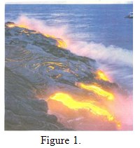
When discussing the formation of the earth, for example, CAMS students are introduced to the idea that our planet has a molten core, and that, in some places, magma from this core breaks through the earth’s crust. An illustration of this, taken in Hawaii, shows the dramatic results that occur when a stream of magma enters the sea (Figure 1).
Similarly, having introduced the concept of igneous, as opposed to sedimentary, rock formation, it is perfectly possible to refer students to examples from various localities in Oman. One illustration, however, showing an igneous rock formation standing above the residue of eroded sedimentary rocks accomplishes the same task just as well (Figure 2).

Illustrations, moreover, can be used to foster critical thinking. It is one thing to give students a reading passage that informs them that the hydrogen bonds in water give its solid form a lesser density than the liquid. As a result, ice floats on water, and insulates the water below it. This, in turn, prevents the planet from cooling down to the point that life becomes impossible.
Contrast that rather prosaic approach, with an illustration of ice cliffs and the startlingly blue water of run-off (Figure 3).
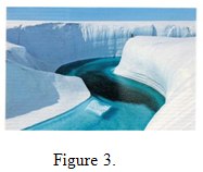
Then ask the students what they can deduce about the respective temperatures of the ice and the water. Only very few will immediately understand that, by definition, the liquid form MUST have a temperature higher than zero degrees centigrade. The majority are usually deceived into believing that the water is colder than the ice.
Moving from physical geography to the more conventional concerns of agriculture and marine sciences, illustrations are perfect for introducing concepts like tea plantations (Figure 4), vineyards (Figure 5)

and fish farming. The first two are totally foreign to the experience of Omani students, and while some fish farms exist on the Batinah coast, a rather dramatic illustration from the Faroe Islands (Figure 6) instantly demonstrates that fish farms can be established on what appears to be open sea.

Again, student thinking can be challenged by introducing the concept of specialized farming. One example here is prawn farming. Most Omani students are familiar with prawns as food; they appear in seafood pizza, as exotic ingredients in soups (Figure 7) and can be enjoyed as delicacies in their own right.

The muddy reality of a Thai prawn farm (Figure 8), however,

may come as an unwelcome shock and actually cause some students to start thinking about the conditions that apply where their food comes from.
With regard to animals and poultry, some Omani students may be unaware that there is a flourishing trade in “exotic” animals like reindeer (Figure 9).

They may also believe that poultry only come in a limited number of varieties, and correcting this misconception can segue into a consideration of selective breeding.
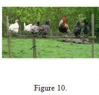
Taking a leaf from neuro-linguistic programming (Revell and Norman 1997; 1999), students can be asked to sit quietly, close their eyes, take a few deep breaths and think about chickens. Give them a little time, and then ask them to open their eyes and look at a picture of, for lack of a better term, “conventional” chickens. Ask them if this is the sort of bird that they envisioned (Figure 10) and most of them will agree.
Then introduce pictures of two or three fancy breeds (Figures 11, 12 and 13)
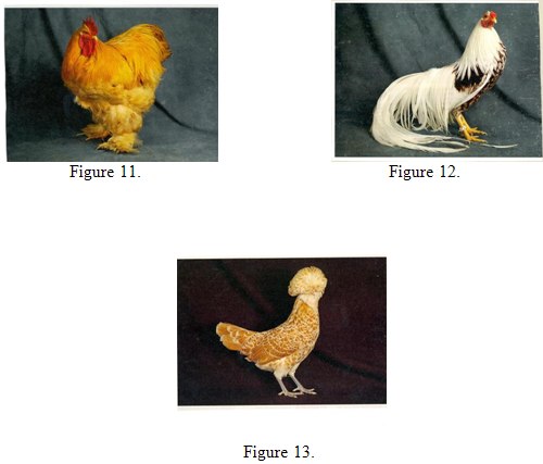
and watch the reaction. From this, the concept of selective breeding - Darwinism given a push – follows fairly naturally.
At this point, I will turn from the use of pictures with CAMS Students, and look at pictures taken from Omani advertising. These have been used with CAMS students, as a light hearted look at nutrition, but they raise some quite important points, particularly when considering how advertisements may backfire.
The classic example of that was the early 1950s British cinema advertisement for Strand cigarettes. This showed a young man in a trench coat, walking (appropriately enough) in an area called the Strand, down by the River Thames in London. There was a haunting sound track. The whole thing was shot in black-and-white. The slogan was “You’re never alone with a Strand.”
As an advertising campaign, this was a disaster. The message picked up by cinema audiences was that if you were a complete loser, who had no friends at all, and things had got so bad that you were thinking about throwing yourself into the Thames, this was the cigarette for you.
Now, in the same way, it is possible that an advert showing a rather plump boy staring with delight at a large plate of chicken nuggets (Figure 14) could also send the wrong message.

The advertisers obviously do not intend to suggest that their product triggers pre-teen obesity and possible diabetes, but that message can be inferred.
The same, inadvertently contradictory, message arises from two other adverts. The first shows a rather overdressed young woman (she is wearing a headscarf in the privacy of her own kitchen) who is consulting a recipe book – as well she may (Figure 15).

Her ingredients are a rather small chicken, one large lime, a large potato, a tomato, three hot peppers and three pieces of garlic. Quite what she intends to produce from so random a collection is definitely open to question.
A second advert shows a plump, elderly woman ladling what appears to be chicken biryani onto the plate of a much younger woman, who is wearing a rather fixed smile (Figure 16)
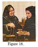
In the light of Mernissi’s (1983) comments on the relationship between Arab mothers and their daughters-in-law, and Adiche’s (2006) portrait of a dominant African mother, this picture could easily be interpreted as the older woman giving a rather heavy-handed lesson on just how food ought to be prepared.
The most interesting examples, however, come from a complementary pair of advertisements.

In the first (Figure 17), an Omani boy of about 12 is reacting with open-mouthed delight to a plate of grilled chicken. It is not entirely clear why he is so excited, as careful observation reveals that he already has a plateful of the same food on the table. Indeed, an entire roast chicken and a soup bowl full of dates are also present. His older sister, however, is looking rather quizzical, because her plate contains only a single lettuce leaf, a fragment of tomato and half a grilled onion. Even allowing for the kind of disparities of gender treatment found in patriarchal societies, this seems somewhat extreme.
In the second advert, however, it appears that the boy and his older sister are, in fact, mother and son. They appear with the husband and a younger sister, all staring in amazed delight at yet more grilled chicken and dates (Figure 18).

As the family are all well dressed, well nourished and actually appear to be rather prosperous, their euphoria is surprising. More importantly, however, their intended portrayal of a typical, young, affluent or middle-class Omani family raises one crucial question. The father is in his late 20s. The mother is in her early 20s. The son is 12. His sister is about ten. So is this advertisement a covert endorsement of child marriage? The mother can only have been little more than a child herself when she is supposed to have given birth.
It is, of course, easy to mock advertisements, but they have a real, and potentially dangerous, power. Eldridge, Kitzinger and Williams (1997), however, demonstrate that the power of sponsorship loses its force in the face of hostile or skeptical audience reception. Put simply, advertisers find it more difficult to manipulate the public, if the public are aware of the advertisers’ intentions.
This brings us back to the importance of critical thinking, and might even be said to be moving in the direction of critical pedagogy (Raddawi and Troudi 2012) or social justice (Gutstein 2003; Tanko and Atweh 2012). Certainly, learning how to deconstruct advertisements empowers the (comparatively) powerless by teaching them to separate fact from opinion, and persuading them that there is nothing wrong with bringing critical judgement into play.
It is an old cliché that “a picture is worth a thousand words”. More often than not, this is no longer the case, as we now live in a world where we are constantly bombarded with images. What remains true, however, is that “every picture tells a story”, and some can tell more than one story. In the past 40 years we have come a long way from the Janet and John, Dick and Jane world of J.B. Heaton, and we have moved on from the holiday destinations of the Cambridge First Certificate.
Even so, there is no need for us to throw the baby out with the bathwater. Magazine pictures are decidedly low-tech, but I hope that I have successfully illustrated how they can be used to reinforce sophisticated concepts, and how judicious selection of material can enable teachers to empower their students by activating both their passive knowledge and their critical intelligence.
Adice, C.N. (2006). Half a Yellow Sun. London. Harper Perennial.
Alexander, L.G. (1971). Fluency in English. London. Longman.
Bendetti, L.; Coscia, M. and Arriaga, C. (2013). Internationalisation at home;
Bringing the world into the classroom. Professional and Academic English 41.
8-12.
Candlin, E.F. (1982). New Present Day English 1. London. University of London
Press.
Candlin, E.F. (1982). New Present Day English 2. London. University of London
Press. Modern Britain. Oxford. Oxford University Press.
Gutstein, E. (2003) Teaching and learning masthematics for social justice in
an urban Latino school. Journal for Research in Mathematics Education 34/1.
37-73
Heaton, J.B. (1966). Composition through Pictures. London. Longman.
Heaton, J.B. (1975). Beginning Composition through Pictures. London.
Longman.
Holliday, A. (2005). The Struggle to Teach English as an International Language.
Oxford. Oxford University Press.
Kamont, A. (2013). Making the most of your virtual classroom. Modern English
Teacher 22/2. 42-45.
Martin-Monje, E. (2012) From VLE to PLE in English for Specific Purposes.
Professional and Academic English 40. 14-18.
McBeath, N. (1993). The Preparation of a Resource; Magazine Pictures as a Visual
Aid. The Journal of English Language Teaching (India) XXVIII/5.
McBeath, N. (2009). The Challenge of Writing Supplementary Materials. In
Susan Finlay and Neil McBeath (eds) Responding to Challenges in Curriculum,
Assessment and Independent Learning; Proceedings of the Oman 9th
International ELT Conference. Muscat. Sultan Qaboos University. 159-169.
McBeath, N. (2010). Best Practice; Easier Said than Done? In Neil McBeath (ed)
Current Perspectives in ELT; New Methodologies, Research and Best Practice;
Proceedings of the Oman 10th International ELT Conference. Muscat. Sultan
Qaboos University. 60-71.
Mernissi, F. (1983). Beyond the Veil; Male-Female Dynamics in Muslim Society.
London. Saqi Books.
Prensky, M. (2001). Digital natives, digital immigrants. Retrieved May 18, 2013 from
www.marcpresnky.com/writing/Presnky/
Price, L. (2013) Learners in the 21st Century; Are They Any Different? Paper
delivered at the 19th International TESOL Arabia Conference, Dubai, UAE,
14-16 March, 2013.
Raban, J. (1979). Arabia through the Looking Glass. London. Picador.
Raddawi, R. and Troudi, S. (2012). Critical Pedagogy in the Arab World.
Paper delivered at the 18th International TESOL Arabia Conference, Dubai,
UAE. March 8-10, 2012.
Richards, J.C. (1998). Beyond Training. Cambridge. Cambridge University Press.
Reilly, P. (2012). Understanding and Teaching Generation Y. English Teaching
Forum 50/1. 2-11.
Skiba, D and Barton, A. (2006) Adapting your teaching to accommodate the net
Generation of learners. OJIN: The Online Journal of Issues in Nursing. Retrieved
May 18, 2013 from
www.nursingworld.org
Stannard Allen, W. (1975). Living English Structure. London. Longman.
Tanka, M.G. and Atweh, B. (2012). Developing Mathematical Knowledge through
Social Justice Pedagogy with Young Adult Arab Women. In J. Dindyai; L.P. Cheng
and S.F. Ng (eds) Mathematics Education; Expanding Horizon. (Proceedings of
The Mathematics Education Research Group of Australia, eBook pp. 720-771)
Singapore. MERGA inc.

Please check the CLIL for Secondary Teachers course at Pilgrims website.
Please check the CLIL for Universities course at Pilgrims website.


|